Colour & Pattern
Tonal dressing: one colour, many values
Wearing several shades of one colour is the easiest way to look deliberately dressed. It is also the technique most likely to look like an accident if the shades are too close.

Tonal dressing means building an outfit from one hue at different values — light to dark. Monochrome, strictly, means a single colour throughout.
Both work for the same reason: removing hue variation from the outfit means the eye reads silhouette and texture instead, which produces a longer, cleaner line and a more considered impression.
Why it lengthens
Horizontal breaks in colour divide the body into segments, and the eye reads each segment separately. A contrasting waistband, a different-coloured top and bottom, or a belt in a strong colour all create boundaries.
An outfit in one colour family has fewer boundaries, so the eye travels uninterrupted. This is the mechanism behind the observation that tonal outfits are lengthening — it is not about the colour, it is about the absence of interruption.
The mistake that makes it fail
Shades that are close but not the same. Two navies that do not match, or a grey top with slightly different grey trousers, read as an error rather than as a choice.
The fix is to make the difference obvious. Either match exactly — the same garment set, or pieces from the same fabric — or separate the values clearly: pale blue with mid blue with navy, rather than three mid-blues.
A useful rule of thumb: if you have to look twice to decide whether two pieces match, they do not.
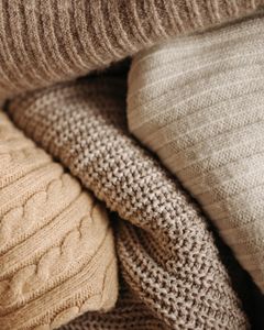
An all-navy outfit in identical smooth fabrics is flat. The same colours in flannel, ribbed knit, oxford cotton and suede is not.
Without hue variation, texture is the only source of interest. Which means tonal dressing depends more on fabric variety than any other approach — and it is why it works well in winter, when heavier and more varied textures are in play.
The easiest colours to do this with
Navy. Available in an enormous range of values from pale blue through to almost black, and in every fabric.
Grey. The widest value range of any neutral, from near-white to charcoal.
Brown and camel. Warm, currently ubiquitous, and available from cream through to chocolate.
Green. Sage through olive to forest. Harder to source and effective.
Black. The most difficult, because black has essentially no value range — black is black, and an all-black outfit therefore has no tonal variation at all. It depends entirely on texture and silhouette, which is why all-black works in design-led dressing and can look flat otherwise.
Building one
Pick three values — light, mid, dark — within one hue family.
Vary the texture between them deliberately.
Add one small break if it needs it: a metal, a leather in a different tone, a small accessory. This is optional and frequently unnecessary.
Keep shoes in the family or in a clear neutral. A strongly contrasting shoe cuts the line at the ankle and undoes the lengthening effect.
The near-neutral extension
A softer version that is easier to assemble: build within a temperature rather than a hue.
Cream, camel, tan and warm brown are four different hues that read as one family because they share warmth and low saturation. The same applies to a cool group of white, pale grey, charcoal and navy.
This gives most of the coherence of tonal dressing with considerably more available options.
Where it does not work
Low-contrast colouring in a colour close to your own value. If skin, hair and clothing are all mid-tone, the effect is uniform in an unflattering way — the person disappears into the outfit. Adding a light or dark element near the face fixes it.
Very casual contexts, where a fully tonal outfit can read as more deliberate than the situation calls for.
Without texture variation, as above. This is the most common failure.
The reason it is worth learning
It is the most reliable way to look put together with the least decision-making, and it requires no colour judgement at all beyond picking one family.
Which makes it the natural approach for anyone who finds colour combination difficult, and the reason it appears so consistently in the wardrobes of people whose clothing is described as effortless.
Also by Noor Haddad
- Building a capsule wardrobe by subtraction rather than purchaseCapsule Wardrobe
- Cost per wear: the only shopping arithmetic worth doingShopping Smart
- Why some colours suit you: contrast and undertone, without the seasonsColour & Pattern
- Buying clothes secondhand online without being disappointedShopping Smart