Colour & Pattern
Colour against different complexions
Most colour advice was written for a narrow range of skin tones and translates badly. The underlying variables — undertone, depth and contrast — apply universally; the recommendations attached to them do not.
The colour analysis systems in general circulation were developed largely in the 1980s in North America and Europe, and their example palettes and category names reflect that. Applied to darker or deeper complexions, the advice frequently produces recommendations that are either wrong or unhelpfully cautious.
The mechanics, though, are general. Three variables determine how a colour interacts with any skin.
The three variables
Undertone — the cast beneath the surface colour: warm (golden, olive, yellow), cool (pink, red, blue) or neutral. Independent of depth. Every skin depth includes all three undertones.
Depth — how light or dark the skin is. This determines which values create pleasing contrast and which disappear.
Contrast level — the tonal gap between skin, hair and eyes. Determines whether high-contrast or tonal outfits work better.
Systems that collapse these into a single category lose information, which is why two people assigned the same season frequently find the same palette works for one and not the other.
In north-facing daylight, without makeup, hold gold and silver against your face. One usually makes the skin look brighter and more even; the other can make it look sallow, grey or ashy. Gold favouring suggests warm, silver cool, both working suggests neutral.
This works across all skin depths and is more reliable than the vein test, which depends heavily on skin thickness and lighting.
What depth changes
The main practical difference, and the one the older systems handle worst.
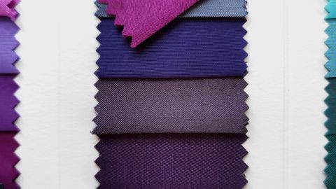
Deeper complexions generally carry saturated, rich colour exceptionally well — true reds, cobalt, emerald, fuchsia, mustard, orange. These colours can overwhelm very pale skin and sit beautifully against deeper tones because the value relationship works.
The colours that tend to be less successful are pale, washed-out pastels close to the skin's own value, which can read as flat because there is insufficient contrast.
This is close to the opposite of what generic advice frequently recommends, which tends to steer everyone toward muted tones.
Lighter complexions have more room at the dark end and less at the bright end — very saturated colours can dominate, and deep values create strong contrast.
Mid-depth complexions, including many olive and Mediterranean tones, have the widest range and the most sensitivity to undertone, since a colour of the wrong temperature is more visible when the value contrast is not doing the work.
Olive skin specifically
Frequently mishandled by the systems, because olive is a green-toned undertone that does not fit neatly into warm or cool.
Olive complexions frequently look excellent in warm earthy tones — olive, rust, mustard, camel, warm browns — and in rich jewel tones. Colours that can be difficult are those close to the skin's own greenish cast, particularly pale khaki and certain yellows, which can produce a sallow effect.
The specific colours worth testing
Rather than accepting a palette, test individual colours against your own face. The ones that differentiate most:
Pure white versus cream. Cool undertones generally favour white, warm favour cream. This one is usually obvious.
Silver versus gold. As above.
Bright coral versus fuchsia. A useful warm-versus-cool test in the pink family.
Olive versus emerald. Warm versus cool green.
Camel versus grey. Warm versus cool neutral.
Black. Test it honestly rather than assuming. Black is unflattering on a meaningful proportion of people across all skin depths, and the determining factor is contrast level rather than depth.
The face-adjacent principle
All of this applies to what is worn near the face. Reflected light from a garment affects how the skin reads, and the effect falls away rapidly with distance.
Which means anything below the waist is essentially exempt, and a scarf, a collar or a layer in a flattering colour will neutralise an unflattering garment worn under it.
This is the single most useful practical consequence and it is rarely mentioned.
What to disregard
Any system offering a fixed list of forbidden colours. Any analysis conducted under artificial light. Any category name that implies a personality.
And any claim that this is settled science — the mechanics of value and reflected colour are real, the categorisation systems built on top of them are not.
What survives is a method: hold it against your face, in daylight, look at the skin rather than the garment, and photograph it in greyscale if you are unsure. That works for everyone.
Also by Noor Haddad
- Building a capsule wardrobe by subtraction rather than purchaseCapsule Wardrobe
- Cost per wear: the only shopping arithmetic worth doingShopping Smart
- Why some colours suit you: contrast and undertone, without the seasonsColour & Pattern
- Buying clothes secondhand online without being disappointedShopping Smart