Colour & Pattern
Pattern, scale and the reason your check shirt does not work
The rule about not mixing patterns is wrong and unhelpful. What actually determines whether two patterns work together is scale, and the principle takes about a minute to learn.
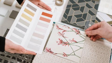
The instruction not to mix patterns produces a lot of very safe, very dull outfits. Anyone who has looked at a well-dressed person in a striped shirt, a checked jacket and a patterned tie knows the rule is not a rule.
What governs whether combinations work is scale, secondarily colour, and only distantly the number of patterns involved.
The scale principle
Two patterns of similar scale placed next to each other compete — the eye cannot decide which to read, and the effect is visually noisy and sometimes genuinely uncomfortable to look at, an optical vibration.
Two patterns of clearly different scale read as a hierarchy. The larger becomes the ground, the smaller becomes texture, and the eye is comfortable.
So the working rule is: vary the scale substantially. Not slightly — obviously. A fine pinstripe with a bold windowpane check works. A medium stripe with a medium check does not.
Think of each garment in a layered outfit as occupying a scale slot. If the jacket carries a large pattern, the shirt should be small or plain, and any accessory medium. If the shirt carries the boldest pattern, everything else steps back.
Only one element should be loudest. That is the entire technique.
The pattern families
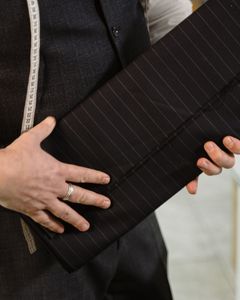
Stripes. Directional and strongly graphic. Pinstripes are the finest, then chalk stripes, then bengal and awning stripes at the bold end. Vertical stripes are conventionally lengthening, though the effect is subtle and depends heavily on spacing.
Checks. An enormous family. Gingham is small and even. Windowpane is a widely spaced grid. Glen check, or Prince of Wales, is a complex composite that reads as texture at distance and as pattern up close — one of the most versatile patterns there is, precisely because its apparent scale changes with viewing distance. Tattersall, houndstooth, madras and tartan each behave differently.
Dots. Non-directional and comparatively easy to combine, because they read as texture at small scale.
Florals and botanicals. Organic and irregular, which makes them combine surprisingly well with geometric patterns — the irregularity prevents the competing-grid problem.
Paisley. Complex and busy. Works best as the loud element with plain or micro-patterned support.
Herringbone, birdseye, nailhead. Technically weaves rather than prints, and they read as texture rather than pattern at any normal distance — which makes them close to neutral and extremely useful as a base.
Colour is the second lever
Patterns that share a colour cohere even when the patterns themselves are unrelated. A navy-and-white stripe with a navy-and-rust check works because navy links them.
The corollary: two patterns with entirely unrelated palettes need to work harder on scale to succeed.
The safest structure for a beginner is patterns in the same colour family at clearly different scales — a navy micro-check shirt under a navy windowpane jacket, for instance.
Texture as an alternative
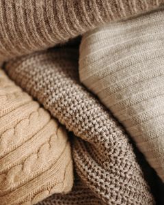
The most underused option. An outfit made entirely of plain garments in different textures — a knitted tie, a flannel jacket, an oxford shirt, a linen pocket square — has visual interest without any pattern at all.
Texture combines almost freely, because it does not create competing grids. For anyone finding pattern combination difficult, this is where to start.
Where it goes wrong
Two mediums. The classic error. A medium stripe with a medium check is the most common failed combination.
Too many equal voices. Three patterns can work; three patterns at the same volume cannot.
The moiré effect. Very fine, regular patterns — tight herringbone, fine houndstooth, dense pinstripe — can produce visible shimmer on camera and on screens. If you are photographed or on video regularly, this is a practical reason to avoid the very finest patterns.
Scale relative to the wearer. A very large check on a small frame overwhelms, and a micro-pattern on a large frame disappears. Pattern scale should bear some relationship to the size of the area it covers.
A workable starting formula
One bold pattern. One micro-pattern or texture. Everything else plain. A shared colour running through at least two of them.
That produces a coherent outfit essentially every time, and once it feels natural the scale principle is easy to extend. The rule about not mixing patterns exists because it is impossible to get wrong — which is also why it is impossible to get right.
Also by Noor Haddad
- Building a capsule wardrobe by subtraction rather than purchaseCapsule Wardrobe
- Cost per wear: the only shopping arithmetic worth doingShopping Smart
- Why some colours suit you: contrast and undertone, without the seasonsColour & Pattern
- Buying clothes secondhand online without being disappointedShopping Smart