Colour & Pattern
Colour combinations that work, and the reasoning behind them
Complementary, analogous, triadic — the colour wheel gives you the vocabulary. What it does not tell you is that saturation and value matter more than hue relationships in clothing.
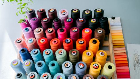
Colour theory as taught in art classes describes relationships between hues on a wheel. It is useful and it is incomplete for clothing, because two garments in complementary hues can look terrible together if their saturation and value are mismatched.
The three properties
Hue is the colour itself — red, blue, green. This is what the colour wheel describes.
Saturation is intensity. A saturated red is vivid; a desaturated one is dusty and muted.
Value is lightness or darkness.
The practical rule that most outfit failures violate: keep saturation consistent across an outfit. A dusty sage green with a vivid electric blue looks wrong not because of the hues but because one is muted and one is not. The same sage with a dusty terracotta works immediately.
This is why muted palettes are easy and why mixing a vintage-toned garment with a bright new one is difficult.
The hue relationships, briefly
Complementary — opposite on the wheel. Blue and orange, red and green, purple and yellow. High contrast, high energy, and difficult at full saturation. Works far better when one is dominant and the other is a small accent, or when both are muted — navy and rust is complementary, and it works because both have been desaturated.
Analogous — adjacent on the wheel. Blue, blue-green, green. Harmonious and easy, and can read as flat without a value shift between the pieces.
Triadic — three colours evenly spaced. Balanced and busy, best with one dominant and two accents.
Monochromatic — one hue at different values. Navy, mid blue, pale blue. Sophisticated and reliable, and depends entirely on texture variation to avoid looking like a uniform.
Borrowed from interior design and it transfers well. 60 per cent dominant colour — usually a neutral, often the trousers and outer layer. 30 per cent secondary — the top or the knit. 10 per cent accent — a scarf, shoes, a bag.
Roughly equal proportions of two strong colours compete. A clear hierarchy resolves it.
Combinations that reliably work
Navy and cream. Classic, high enough contrast to be interesting, low enough to be soft.
Camel and navy. Warm against cool, and the warmth of camel prevents navy reading as severe.
Grey and burgundy. Muted saturation on both, and the value contrast does the work.
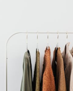
Olive and rust. Both desaturated warm tones, adjacent enough to harmonise.
Denim and white. Effectively a neutral pairing and almost impossible to get wrong.
Black and white. Maximum value contrast. Graphic and severe, and it demands good fit because there is nothing to distract from it.
Charcoal and pale blue. Value contrast with low saturation contrast.
Brown and pink. Underused. The pink should be muted — dusty rose rather than fuchsia.
Combinations that need care
Two saturated brights. Red and cobalt, emerald and fuchsia. They can work and require confidence and good proportion, usually with one clearly dominant.
Near-matches. Two blues that are close but not the same read as a mistake. Either match exactly or make the difference obvious.
Warm and cool versions of the same hue. A warm red and a cool red together look accidental.
Beige and grey — a classic difficulty, because they sit at similar value with opposing temperature. It works when one is clearly darker.
Metallics and prints
Gold reads as a warm neutral, silver as a cool one. They can be mixed, contrary to older etiquette, and it looks deliberate when there is enough of each rather than one stray piece.
A patterned garment supplies the palette for the whole outfit. Pull a colour from the print for one other element — a shoe, a bag, a knit — and the outfit coheres automatically. This is the easiest colour technique there is and almost nobody uses it deliberately.
Testing without committing
Lay the garments out together in daylight before wearing. Colour relationships are far easier to judge flat than on a body in a mirror.
Photograph and desaturate. Converting to greyscale shows the value relationships, which is usually what is wrong when an outfit feels off but the colours seem fine.
Squint. Blurring the image reduces it to blocks of value and proportion, which is roughly what someone sees from across a room.
The permission
None of this is prescriptive. Colour combinations that break every rule here work regularly, and personal taste beats theory.
The value of understanding the mechanics is diagnostic rather than prescriptive: when an outfit feels wrong and you cannot say why, it is nearly always saturation mismatch, insufficient value contrast, or two colours competing at equal proportion. Knowing which lets you fix it rather than abandoning the combination.
Also by Noor Haddad
- Building a capsule wardrobe by subtraction rather than purchaseCapsule Wardrobe
- Cost per wear: the only shopping arithmetic worth doingShopping Smart
- Why some colours suit you: contrast and undertone, without the seasonsColour & Pattern
- Buying clothes secondhand online without being disappointedShopping Smart