Colour & Pattern
Neutral colours are not all the same, and that is the point
Navy, charcoal, camel, cream, olive, brown. Building a wardrobe on neutrals is standard advice and it fails when people pick neutrals that do not work with each other.

A neutral is a colour with low saturation that combines easily with others. The practical advantage is combinatorial: a wardrobe built on two or three neutrals produces far more working outfits per garment than one built on many colours.
Where the advice goes wrong is in treating all neutrals as interchangeable. They are not, and the mistake is usually about temperature.
Warm and cool neutrals
Cool neutrals: pure white, cool grey, charcoal, navy, black, and blue-toned browns.
Warm neutrals: cream, ecru, beige, camel, tan, warm brown, olive, khaki, and warm greys.
Mixing across the temperature line is possible and requires deliberate handling. Cream against charcoal reads as slightly muddy to some eyes; the same cream against warm brown looks intentional.
The practical approach: pick a temperature and build within it, then break the rule knowingly once you can see what is happening.
Navy and black — widely called a mistake and worn constantly by well-dressed people. It works when the contrast is clear — a genuinely dark navy against genuine black, in different textures — and fails when the two are close enough to look like an accident. Different fabrics help enormously.
Brown and black — the same principle. It works with deliberate contrast and enough separation; it fails when it looks like you got dressed in the dark. Adding a third element that references both helps.
Choosing your base
Most wardrobes work best with two dominant neutrals plus a light and a dark.
Navy and grey. The classic and the safest. Both cool, both work with white and with most accent colours, and both flatter a wide range of complexions. Navy is more forgiving than black on most people because it is slightly softer.
Brown and cream. Warm, softer, and increasingly common. Excellent with warm undertones, and with olive and rust as accents.
Black and grey. High contrast, urban, and demanding — black is unforgiving on low-contrast colouring and shows every mark and fade.
Olive and tan. Warm, casual, and unusually versatile with denim.
The neutrals that behave unexpectedly
Camel reads as luxurious and is difficult on very pale warm complexions, where it can wash out. It is exceptional against navy and against cream.
Olive is technically a colour and functions as a neutral because it is desaturated. It combines with almost everything and is one of the most useful trouser colours there is.
White is not one thing. Optic white is cool and stark. Off-white, cream, ecru and ivory are progressively warmer and softer. Wearing pure white and cream together looks like a laundry error.
Grey has temperature too. A blue-grey and a warm greige do not sit together comfortably.
Denim functions as a neutral and combines with everything, which is worth remembering when planning a palette.
Adding accent colour
The point of a neutral base is that accents work with all of it.
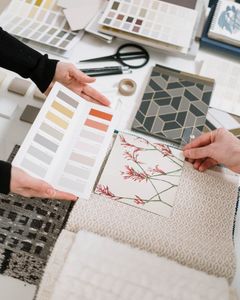
Pick two or three accent colours that all work with your chosen neutrals, and check the combinations rather than assuming. A rust that looks excellent with camel may look muddy against charcoal.
Keep accents in the smaller items where possible — knitwear, scarves, shirts — so that the expensive structural pieces stay neutral and stay versatile.
Texture instead of colour
The technique that makes an all-neutral wardrobe interesting rather than flat.
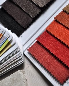
An outfit of navy, grey and cream in identical smooth fabrics is dull. The same colours in flannel, ribbed knit, oxford cotton and suede is not — the surfaces catch light differently and create variation without introducing colour.
This is why tonal dressing works when it works: the interest comes from texture and from small shifts in value, and both are invisible in photographs of the garments individually.
The failure mode
An all-neutral wardrobe can become genuinely joyless, and the minimalist aesthetic that promotes it is a style rather than a universal good.
If you like colour, wear colour. The combinatorial argument for neutrals is about efficiency, not about taste, and a wardrobe of grey that you find depressing is not a well-functioning wardrobe however many outfits it technically produces.
The compromise most people land on: neutral structure — coats, trousers, shoes, bags — with colour in the layers closest to the face, where it does the most work and costs the least to replace.
Also by Noor Haddad
- Building a capsule wardrobe by subtraction rather than purchaseCapsule Wardrobe
- Cost per wear: the only shopping arithmetic worth doingShopping Smart
- Why some colours suit you: contrast and undertone, without the seasonsColour & Pattern
- Buying clothes secondhand online without being disappointedShopping Smart