Colour & Pattern
Texture As Pattern When The Colour Is Uniform
An outfit in a single colour is read through surface rather than hue, which is why texture differences do the work that colour contrast normally performs.
Dressing in one colour removes the eye's usual means of distinguishing garments. What replaces it is texture, and an outfit that ignores this reads as flat.
The eye needs edges
Visual separation between garments normally comes from a change in colour at the boundary. In a single-colour outfit that boundary disappears.
Texture restores it. A smooth surface against a rough one produces a visible edge because the two reflect light differently even at identical hue.
Without that difference the outfit becomes one continuous mass, which is why a matching set in the same fabric can look like a garment bag rather than clothing.
Surface controls how much light returns
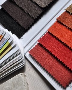
A flat, tightly woven surface reflects light evenly and reads as its true colour. A raised or napped surface scatters light and reads slightly darker and softer.
This means the same dye lot in flannel and in poplin will look like two shades. In a single-colour outfit that apparent difference is useful rather than a fault.
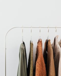
Knits, corduroy, brushed wool and suede all sit at the scattering end. Poplin, twill, satin and smooth leather sit at the reflecting end.
Texture reads as pattern at a distance
A pronounced weave such as herringbone, hopsack or a cable knit resolves into pattern close up and into texture further away.
That dual reading makes textured cloth useful where a printed pattern would be too assertive. It provides interest without committing the garment to a motif.
It also ages differently. A textured surface conceals creasing and small marks that a flat surface would display clearly.
Depth substitutes for contrast
Within a single colour, small differences in value do the work that contrast would otherwise do. Slightly lighter and slightly darker pieces separate without breaking the scheme.
Combined with texture this is usually enough. Two or three surfaces at slightly different values produce an outfit that is clearly one colour and clearly several garments.
Pushing the value difference too far turns the scheme into an ordinary two-colour outfit, which loses the effect that motivated it.
It is more demanding of fit
With no colour breaks, the shape of the body and the cut of the garments carry the whole impression. Every fit problem is visible because nothing distracts from the outline.
This is why single-colour dressing looks either very good or noticeably poor, with little middle ground. The variable is fit rather than the colour chosen.
It also rewards well-made garments, since construction and drape become the only remaining sources of visual interest once colour has been removed.
Also by Noor Haddad
- Building a capsule wardrobe by subtraction rather than purchaseCapsule Wardrobe
- Cost per wear: the only shopping arithmetic worth doingShopping Smart
- Why some colours suit you: contrast and undertone, without the seasonsColour & Pattern
- Buying clothes secondhand online without being disappointedShopping Smart